A website generates leads when it opens with the problem the visitor already has, asks them to choose their path early, and makes one clear action available everywhere. The form should collect only what you need to reply well, and every enquiry should reach a person quickly.
A website that looks good but produces no enquiries is a brochure. A website that turns visitors into conversations is a lead system.
The difference is rarely one clever feature. It is a sequence of small decisions, and three of our projects show them clearly.
Why should a page start with the visitor's problem?
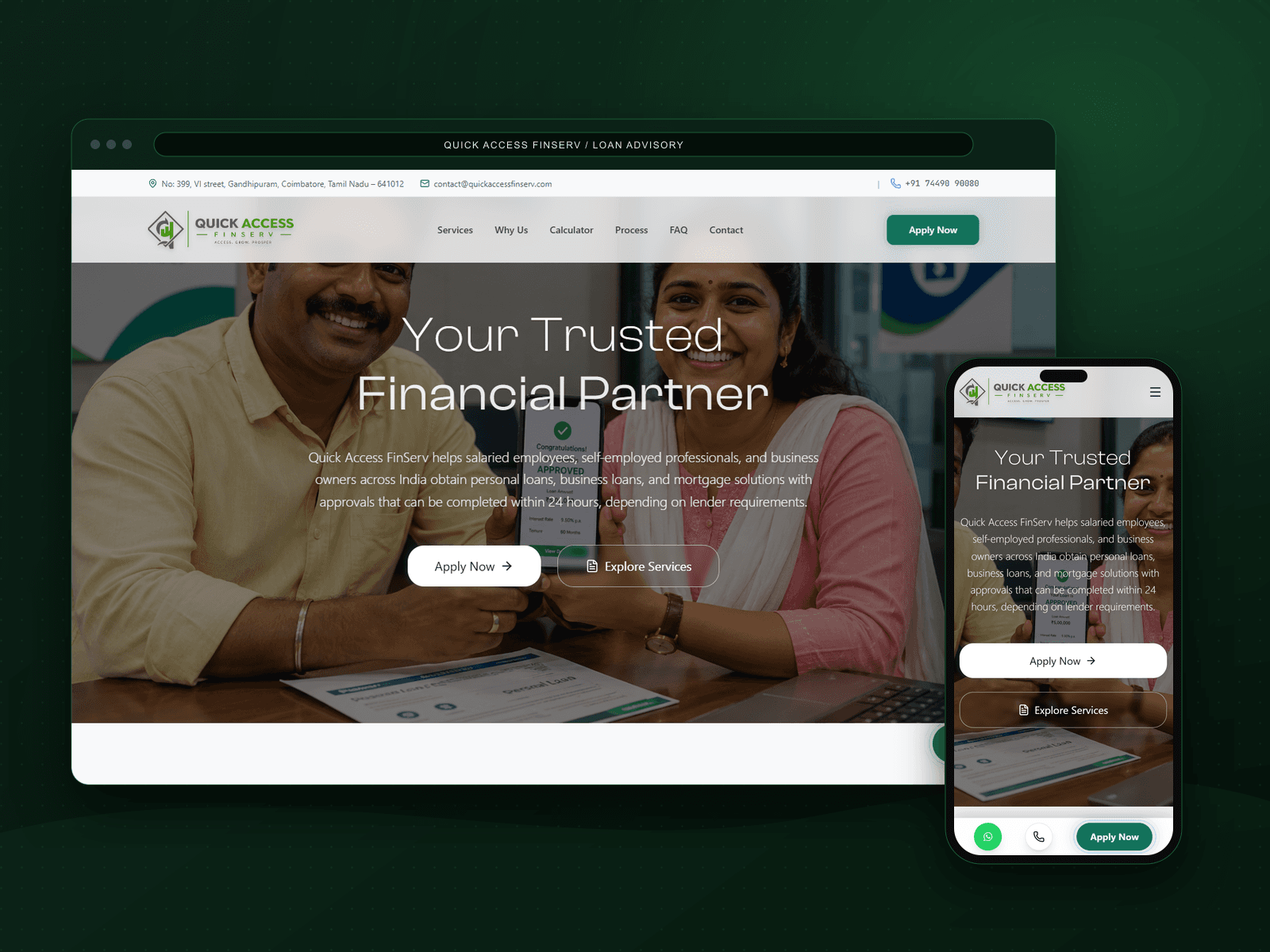
Quick Access FinServ helps salaried employees, self-employed professionals and business owners across India compare and apply for personal, business, vehicle, agri and home loans through one advisor. Borrowers arrive worried about bank visits, hidden fees and unexplained rejections.
So the page opens with those problems, then shows the comparison model with a worked rate example, and only then presents the loan products with direct calls to apply. People act when they feel understood first.
How do you handle visitors with different needs?
Lynqgoo connects local businesses with verified drivers, suppliers and skilled workers. Three services on one homepage can easily confuse everyone.
We put an I am looking for selector at the very top, so visitors choose delivery, supply or workforce before anything else. Each path then speaks to one person with one need.
What is the one action you want?
Grab Spot runs UPI enabled smart vending machines in Coimbatore at campuses, hostels, sports venues and corporate parks. Its most valuable visitor is an institution that could host a machine.
The site is built around that: trusted locations with photos, the leadership team introduced by name, and a direct partner call to action that stays easy to find on a phone.
What happens after someone clicks?
The form is where many leads quietly die. Ask for the minimum you need to reply well, explain what happens next, and keep your response promise realistic. On our own contact page every brief is stored in the studio CRM, the sender receives a reference, and we commit to replying within two business days.
Then measure the journey: which pages lead to enquiries, where people stop, and how quickly each enquiry gets a human reply.
- ✓Open with the problem the visitor already feels.
- ✓Ask visitors to choose their path early when you serve several audiences.
- ✓Make one main action visible on every screen, especially on phones.
- ✓Keep forms short, state the reply time, and route every enquiry to a person.
Common questions
- How many fields should a lead form have?
- As few as you need to reply usefully, usually name, email, what they need and a short description. Add budget or timeline only when it changes how you respond.
- Should a lead generation website use popups?
- Rarely. A clear action in the page and a fast, focused form usually work better than interrupting the visitor.
- How fast should a business reply to a website enquiry?
- As fast as you can reliably manage, and always within the time you promise on the page. A consistent, honest reply time builds more trust than an ambitious one you miss.

Jaiganesh D
Founder of iBOY Innovation Hub, a creative technology studio from Tamil Nadu, India, established in 2025. Writes about what the studio learns while designing and building real websites, products and AI systems.